Well then. I’ve not read any other blogs or anything about this, so I’ll probably end up updating this post with interesting quotes and links.
First things first then — the front page (actually, the first thing is the barcode — the checkout guy spent ages looking for it!). I’m still not sure about the nameplate. Hasn’t losing the capitals from names and titles become passe yet? Apparently the paper is now called the guardian. Or is that theguardian? The masthead itself is probably no bigger than it used to be, but with the smaller page size it takes up almost a third of the entire page. At first it seemed like to much, but I think I’m getting used to that already.
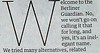 Overall, though, I like the front page. Presumably Column Five will be a regular opinion column; probably an attempt to compete with The Independent‘s ‘concept’ front pages. As Matt T pointed out, that drop cap is massive though. I know a ‘W’ will be bigger than other letters, but it takes up more than half of the width of the column.
 Matt T also points out the white space beneath the headlines. What purpose does this serve?
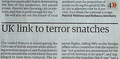 And I know it is separated by a chunky black line, but the “UK link to terror snatches” headline is closer to the article above it than it is to its own. I do like the little menu of stories at the bottom of the page, and the way it tells you which page to turn to for the rest of the article is smart and stylish. I like it. I think the headlines could be bolder though. It seems to lack punch, but maybe the point is to be understated.
The size, I think, is perfect. I was able to flip the pages round like a tabloid. Well, I did struggle a couple of times, but I struggle with tabloids aswell, so… Height-wise it’s just right. I can now read The Guardian without hurting my back!
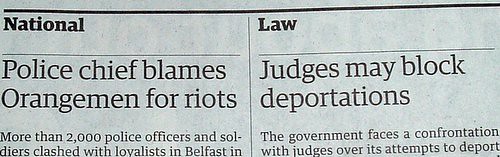
Beyond things like the size and fonts, though, the design doesn’t seem to have changed much to me. Strange bits from the old design which I never understood remain. Like why do ‘National’, ‘Law’, etc need to be in such large boxes?
 Another problem I have is that it’s sometimes difficult to tell which article a photograph is supposed to relate to. I think in general articles could be separated out a bit more, with bold borders or something. Or use ‘bugs’, as I believe they’re called. Some parts of the paper do this, but others don’t.It all looks a bit more tightly-packed (although I don’t know whether or not it actually is).
I like the way the very top-right of the page is used to advertise websites and addresses. A very good way to point out the interesting bits of the Guardian Unlimited website. The purple banners (eg. ‘CIA terror flights’ on page 13) are eye-catching — I like them. A pleasant surprise was the presumably regular new ‘Eyewitness’ feature — a photograph spanning across two pages. A great idea.
Content-wise, I’m quite impressed overall. I have read The Guardian frequently because my father buys it, so I usually take a look. But today I got my own copy and read it on the train, so I got more of a feel for the paper over all. There is a strange moment on page 6 about passport photos (apparently it’s Orwellian that you’re not allowed to smile in passport photos from midnight today — I thought you weren’t meant to smile anyway). We are treated to four pictures of people smiling, seemingly just because. Strange.
Another weird bit is the ‘People’ section on page 16. This seems to be the stories that they couldn’t fit elsewhere, and have shoved them all into this box. The (tenuous) link between them all is that all the people have names, which they highlight by putting everybody’s name in bold. Why?
Comment & Debate. A change in title, but apart from that this section looks very familiar — apart from the leader. Almost a whole page. That’s a lot of leading! Also, the new ‘Response’ section sounds promising, but we’ll have to wait until tomorrow to see that. The promised daily science page is nowhere to be seen.
The next most important thing (for me anyway) is the G2 section. It’s so dinky — I like its size; I think it should suit G2. The problem is, it doesn’t seem to. The G2 is clearly struggling with some things at the moment. The back page is good. And while I do like the Short Cuts section being on pages 2 and 3, and the G2 graphic on pages 4 and 5 is a great idea, after that it all seems to go wrong.
 At first, for instance, I couldn’t tell whose column I was reading. That’s because the writer’s name is written on its side. Between columns two and three. Again, just why? I’m all for weirdy design and stuff, but I can’t see the reason for this. Having it on its side is fine, but why not before the first column? Of course, if the design stays like this in the long-run I’ll get used to it no bother, but this just seems to be needlessly weird.
You have to do a lot of turning either your head or the paper to the side when reading the G2. An old favourite, ‘Review of Reviews’, for instance is on its side. It tells you to cut it out. I don’t see anybody doing that. Style is on its side aswell, and to be honest I can see why they need to do this. But that’s why I think G2 is struggling with its new size.
Television listings have been cut back aswell. In this multi-channel age, it is good that the major digital channels are given equal space with the analogue terrestrial channels. The problem is that all of the other channels have been shunted off for good. With the launches of ITV4 and More 4 coming up quite soon, they might well have to try to squeeze two extra channels in (because I imagine those two channels being quite big). The ‘pick of the rest’ bit will be useful to nobody. Bits and pieces from each channel’s listings are shown, but not a full channel’s listings. This is no help for anybody who actually wants to find out what’s on television. It’s just as well these days we have EPGs — although if you’re going to take that approach, why publish television listings at all?
 The sport and G3 sections have not been squashed to half-Berliner size like the G2 has been. It’s a bit strange for MediaGuardian to be so big! But differences are mainly cosmetic, and there’s nothing too notable here, apart from the font. Where did that come from? The same fonts get used across the paper but MediaGuardian just has to be different, eh?
Overall, I’m quite impressed, but it could do with some tidying up here and there, and the niggles with G2 need to be sorted out.
Update: Here’s an annotated front page on Flickr (via Qwghlm). I hadn’t actually noticed the difference in text between ‘news’ and ‘comment’ (see the note over Column Five)…
Update: Good posts elsewhere:
so long that it has become almost a historic document of the American left. And it draws Arnold Swarnzenegger as a large hand and Bush as an asterix. Priceless, I think you’ll find. And its back from Friday. Woo! LINKEN: Backword Dave hated it. DoctorV was kinda encouraged. B&T can’t stand the spacing. Nosemonkey lements the death of newspaper commentary and thinks the news order is a bit messy. I confess not to submitting a page-turning analysis, but the order of the pages is a little odd…
Not a big fan of the Guardian’s new look. See here if you’re not UK-based. Doctorvee doesn’t think much of the white spaces between the headline and the story. They look to me like a knockoff of the Economist style, with the inherent suggestion that there’s something very important about to be
often the most powerful tool in photojournalism is the stark and bold black & white image, but in the enthusiasm to show-off the Guardian presses’ total use of colour this seems to have been forgotten.” The white space gets less praise over at Doctorvee (“what purpose does this serve?”) while Dave Cross says he’s “not sold on the new masthead”. Cav Scott says “it passes the most important test. It’s easier to read on the loo than the old broadsheet.” From Oxford, Antonia Bance liked the
Berliner – their thoughts
I thought I’d do a normblog-style roundup of the blogosphere’s thoughts on the new format.
Qwghlm is first:
The early verdict then? It’s all right. Content-wise, not too much has changed on the first issue – no doubt once they&#…
[…] See also: doctorvee, Chris A. [ 292 words | Bookmark post on del.icio.us | Permalink | Trackback | ] Tags: guardian, the+guardian, berliner, kakuro […]
[…] doctorvee, Chris A, Mike. [ 302 words | Bookmark post on del.icio.us | Permalink | Trackback | ] Tags: guardian, the+guardian, berliner,kakuro […]
i think you’re totally wrong about G2. i think its a triumph. i think youre suffering a little from shock of the new, i mean, it seems a little tricksy to put the labels on the side of the pagem but after er.. about 2 seconds i got used to it. it seems so much fuller with ideas than before. i love it. its the reaosn i’ll be buying the paper
adrian
Inspecting the furniture
Now that it’s had a working week to settle, here are a few thoughts on the new Grauniad. Brace yourself, there’s a lot to get through….